“Hong Kong Top Brand Awards” , “Hong Kong Top Service Brand Awards” and the "Hong Kong Top Brand Mark Scheme" are schemes to recognise the excellence in branding. To this end, a striking symbol has been designed as the distinctive visual identity to be used in both official occasions related to the Schemes and communication items of the Awardees and Licensees.
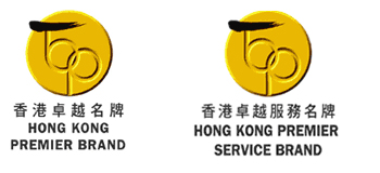
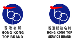
The design concept for the Mark is mainly a combination of two meaningful elements, a seal and a “TOP.” Seal Signifies authority , commitment , credential and consummation. “TOP” literally means prominence and excellence, and the letter “T” and “O” are tangential to make up a letter “b”, which together imply “Top Brand”. The intersecting letter “O” and letter “P” forms a double-rings, representing the corporate logo of the CMA.
Moreover, letter “T” starts with a stroke in Chinese calligraphy. Besides highlighting Hong Kong origin, this stoke demonstrates an upward trend to symbolise continuous growth and incessant pursuit for excellent , and it is in the shape of “一”, which means No.1 in Chinese.
The Ordinary Mark is in primary blue and red color to match the corporate color of the CMA, while displaying a reliable but energetic personality. The Premier Mark, which is a derivative from the Ordinary Mark and exclusively reserved for "Hong Kong Premier Brands" and "Hong Kong Premier Service Brands", uses golden color to signify prestige and superiority. Also , the lower part of the “TOP” can also be interpreted as “bp”, the acronym of “Premier Brand”.